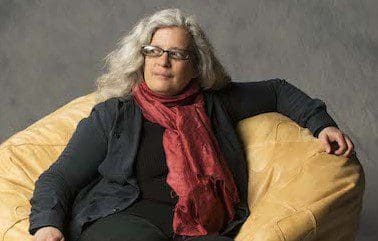
Before we announce the winners of the 2015 MyTheatre Awards, we’re proud to present our annual Nominee Interview Series.
The detail in Eo Sharp’s sprawling, modern set for Peter Hinton’s reimagined modern take on Pygmalion at the Shaw Festival was incredible.
We interrogated the Outstanding Design nominee about what the post-its in Higgins’ office said and what book titles were on the shelf.
Can you remember the first theatre production you ever saw?
I was ten and my best friend’s family took me to see A Midsummer Nights Dream. Her father explained the story. It was spectacular and I still remember it vividly. Years later, when I was studying in theatre school, I realized it was the Peter Brooks production. I’m still in awe of it.
How did you get into designing?
I studied Art History. I loved it, but wanted to take the knowledge and transform it into something else. I waffled between fashion design, costume design and costume curator.
What was the first show you ever worked on?
While I was in university studying theatre design, I volunteered to work in Tarragon’s costume shop. It was Uncle Vanya, directed by Derek Goldby and designed by Michael Levine.
You’ve worked quite a bit with Peter Hinton. How did the collaboration begin and what keeps it together?
Peter left me this wonderful phone message – he had seen a show I designed, the set was all moving mirrors and he loved it. He asked if he could interview me for the Playwright’s Workshop Montreal newsletter. At the end of the interview, he asked me if I would work with him and I have been ever since. I truly love working with Peter. I think we have like sensibilities: baroque modernists or creative anthropologists.
Tell us first about developing the design concept for Pygmalion. What were some of the things in the script that inspired you most?
Both of us were struck by how relevant the themes of the play are today. When Shaw wrote Pygmalion, he wrote it as a contemporary piece; he did not set it hundred years previously in 1810’s. We felt to play it as a period piece was contrary to Shaw’s intention when he wrote Pygmalion. Shaw’s script for the movie version is set in the 1930’s, so we continued on from there.
How did your ideas mesh with Peter’s in your early concept meetings?
When Peter and I design we are having a conversation about the play, about how we see it and what that means. It’s not so much about meshing, but about the two of us constructing a single structure together.
The production was a hyper-modern take on a very classic play. How did you approach honoring both the old and the new with the design?
We were being true to Shaw’s intentions. All the locations are the same. We start in Covent Gardens. Henry has the same apartment on Wimpole Street and his mother [has] hers in Chelsea. Where we got creative is when we asked what would Henry’s apartment look like today – well of course, he would be using modern technology. Some critics felt too much liberty was taken in the modern interpretation of Mrs. Higgins. However we took our inspiration from the text. In Shaw’s time, her neighbourhood was where avant -garde artists lived. And it is those same artists works which Shaw describes as being on the walls of her apartment. Shaw was describing her as an independent and forward thinking woman. And today that would be a career woman.
Projections and video played a big role in the production. How did those factor into your choices?
Video and projected images are a huge part of modern life. So we actively tried to incorporate that technology into every scene. Of course cell phones, Skype and reality television are great sources for comedy as well.
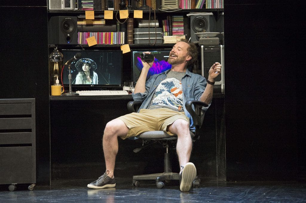
The set was incredibly detailed, especially Henry’s office. What were some of the little details we might have missed from the audience? (Were there specific books on the shelf? What did the post-its say?).
Shaw is infamous for his meticulously long stage directions. On the set are the Piranesi prints he describes. There are a lot of references to Blake and his illustrations to Paradise Lost that were buried in there. There was a ventriloquist dummy with a framed photo of Charlie McCarthy on his knee. All props from the period versions of Pygmalion’s study were in there. Patrick McManus who played Henry Higgins gave me a stack of records that we placed for him. But sadly there was nothing written on the Post-its…
What were some of the technical challenges of the design?
It is gigantic. Moving the Giant E Unit across the stage was a challenge. The set took a lot of space – the British cab alone took a lot of room backstage. The rain was also a challenge – real water is always difficult on stage. Incorporating all the video was also a challenge.
Were you pleased with how the design worked in practice?
You betcha. It worked a treat.
Do you have a favourite moment from the production?
Eliza’s despondent return from the ball, her entering in that lonely shaft of light and channel surfing TV all alone in the dark room. It was heartbreaking.
What would you say is your top priority (either artistic or practical) in any design project?
To be true to a play.
What’s your favourite design you’ve ever worked on?
I’m working on Alice in Wonderland. It is certainly the most ambitious project I’ve worked on. I’m very superstitious and it isn’t finished yet, but I’m very excited about this design.
Can you give us any hints about the design for that show?
Mirrors and glass.
What else do you have coming up?
In Montreal, I’m working with Black Theatre Workshop on a production of Angelique with Mike Payette. He’s a wonderful and very exciting young director.
Do you have anything you’d like to add?
Thank you, Peter.